
Varidx Brand
Identity
End-to-end brand identity design for Varidx — a smart city technology company based in Gurgaon, India. Designed the logo, visual system, letterhead, envelope, and business cards, creating a cohesive identity that communicates technological intelligence, connectivity, and forward motion.
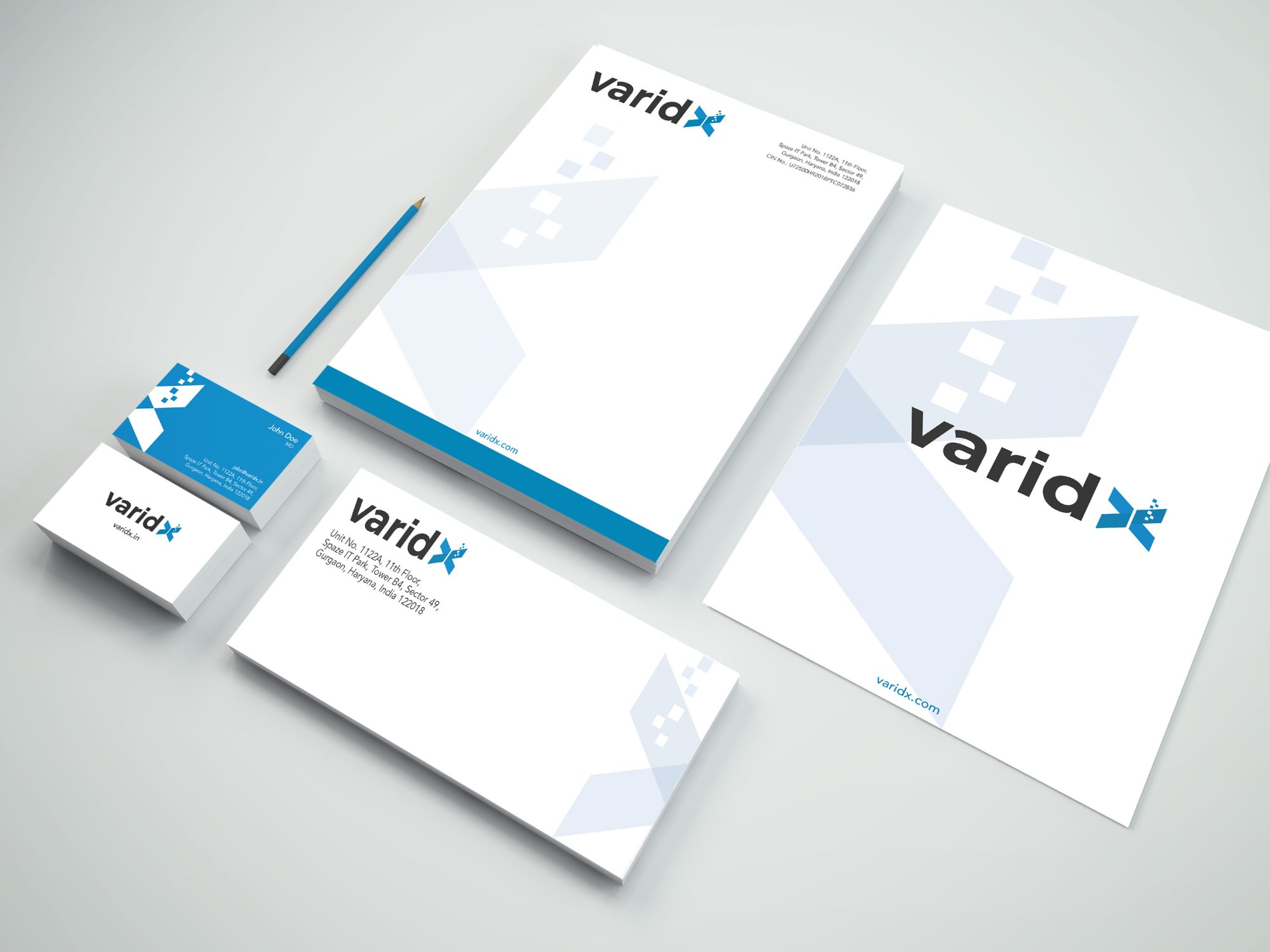
A complete brand identity system — from the logo mark through to every piece of printed collateral — giving Varidx a coherent, professional presence across all touchpoints.
A mark built on connectivity, data, and forward motion
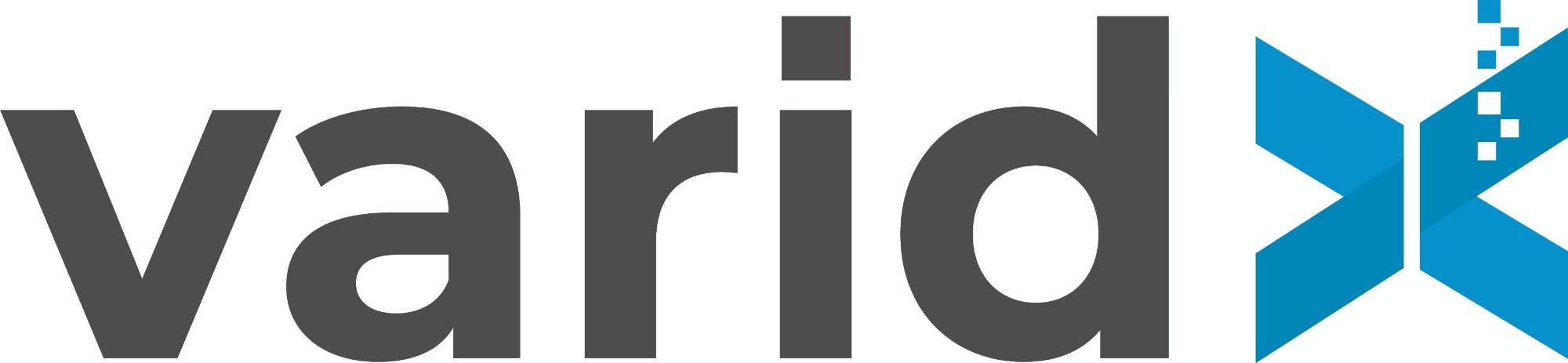
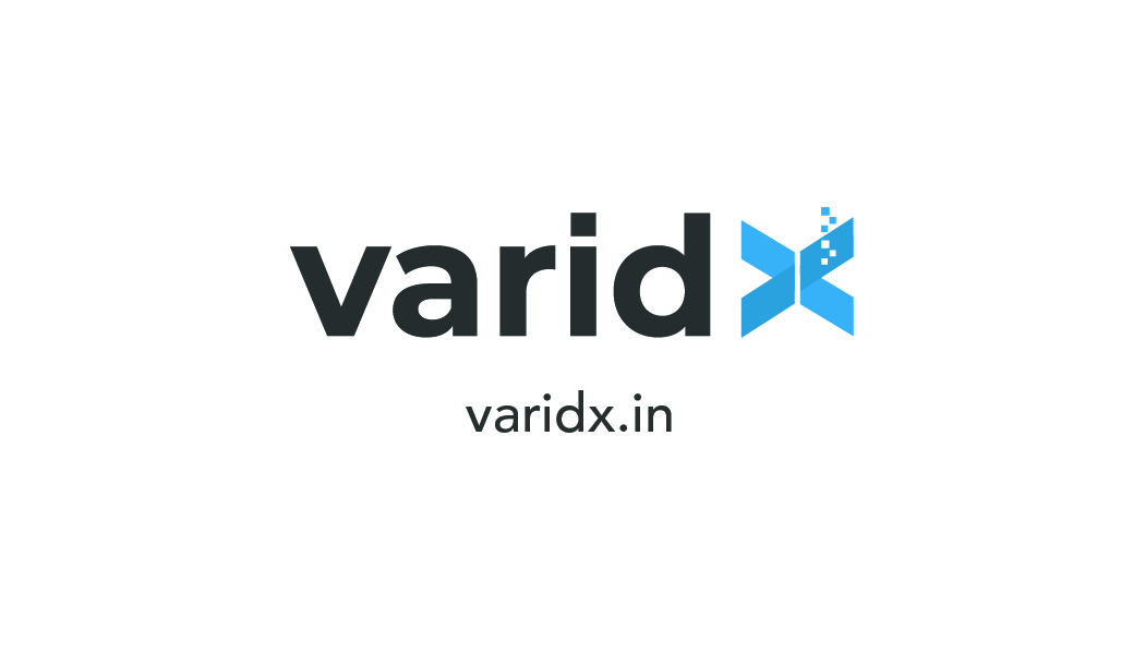
The Varidx wordmark pairs a bold, confident sans-serif with a custom geometric icon — an abstract representation of a smart city network node. The mark uses converging triangular forms to suggest data exchange, connectivity, and directional momentum. The ascending dot pattern references data streams and digital intelligence. The two-tone palette — charcoal grey for strength and sky blue for technology — communicates both reliability and innovation.
Sky Blue
Charcoal
Pure White
Ice Blue
Every piece working together as a system
The brand system was applied across all print collateral — letterhead, envelope, and business cards. The icon mark appears as a large, ghosted watermark pattern across the letterhead and envelope interiors, creating visual depth while keeping the foreground content clean and legible. The blue footer bar and varidx.com website callout appear consistently across all pieces.
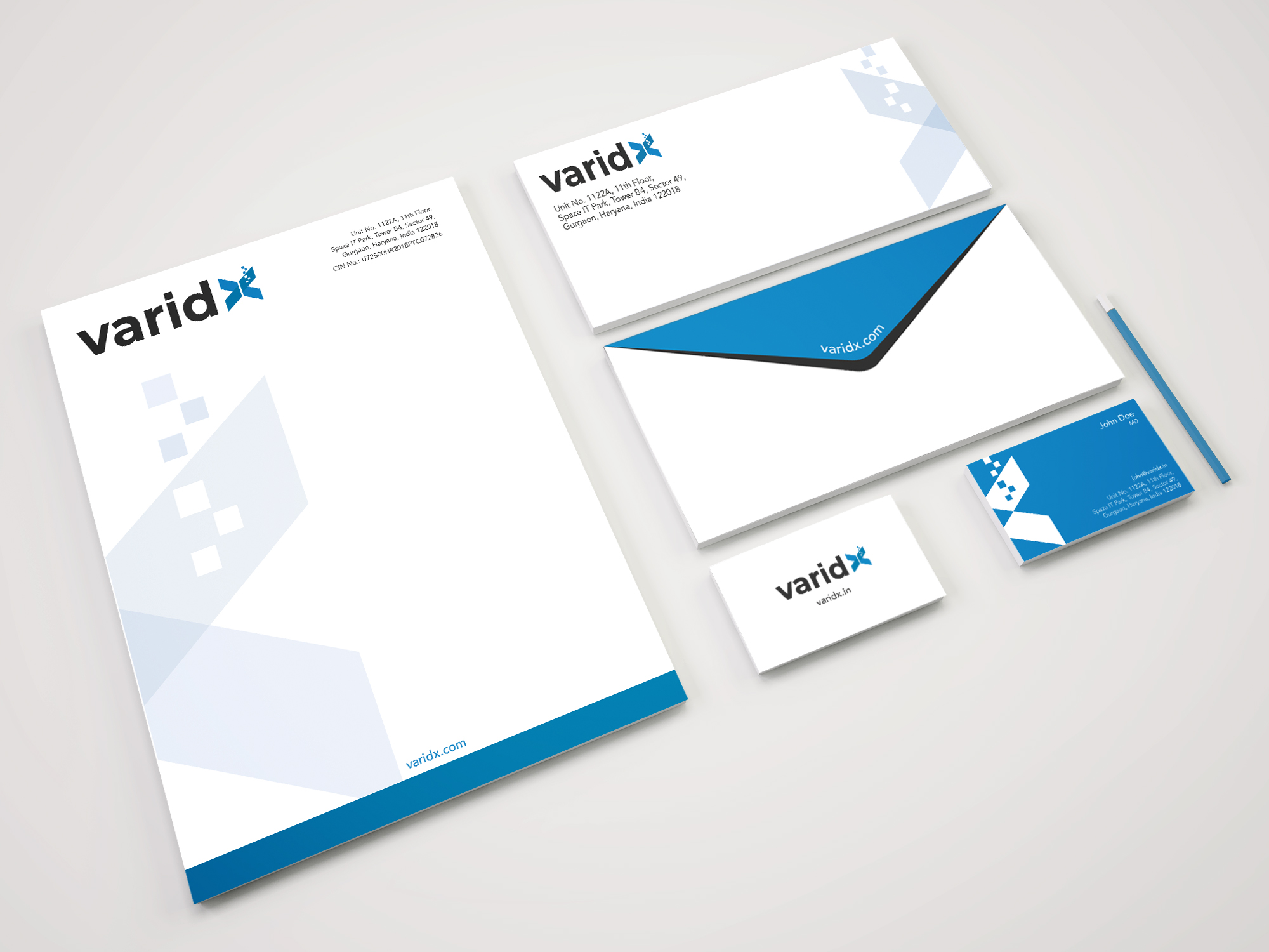
Clean, professional — the brand icon as background texture
The A4 letterhead places the Varidx logo in the top-left with the full company address and CIN number aligned to the top-right. A large ghost rendering of the X icon mark spans the left half of the page as a subtle watermark — giving the page visual interest without competing with letter content. A solid sky-blue footer bar grounds the page and carries the varidx.com URL.
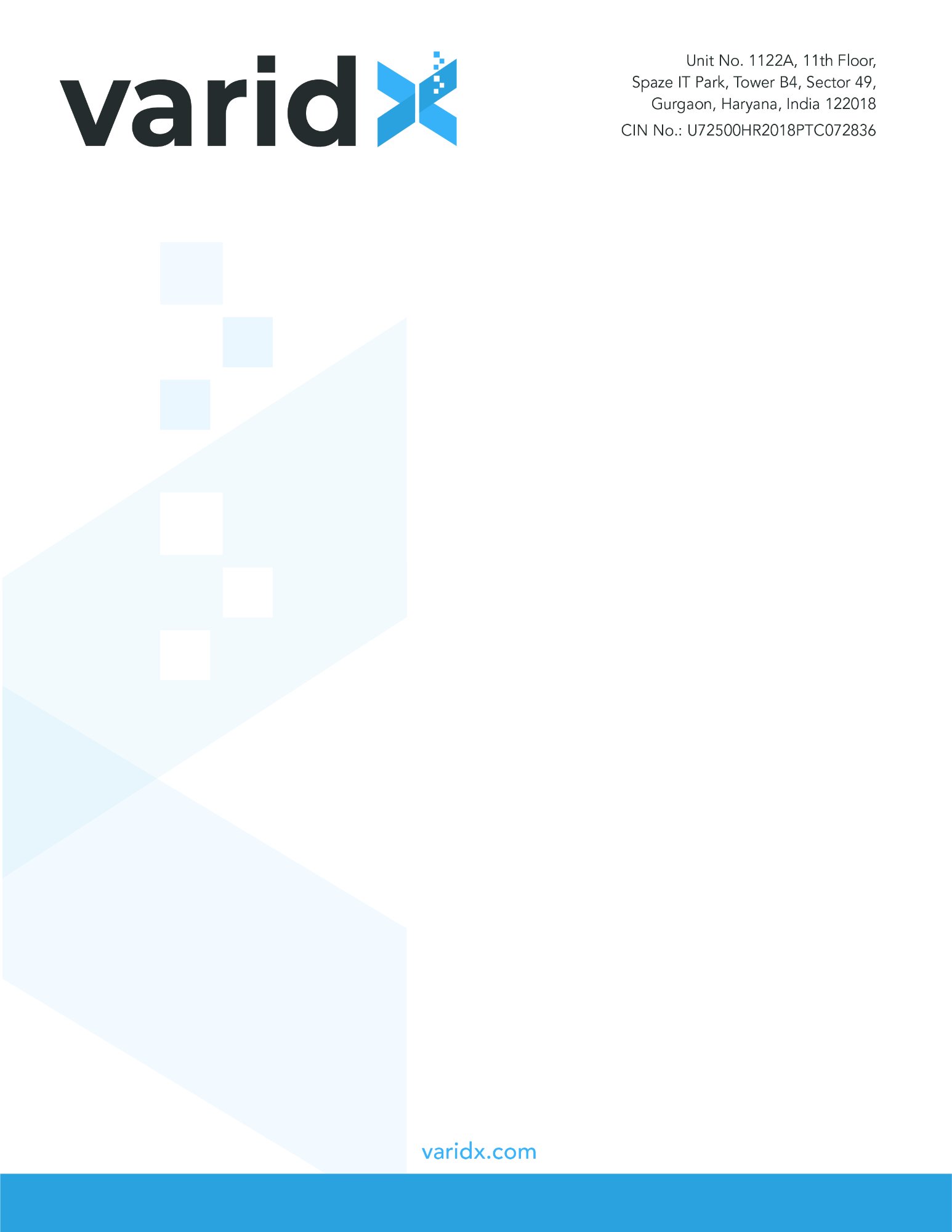
- //Ghost watermark at 8% opacity — visible but never distracting
- //Right-aligned address block creates clean left margin for letter text
- //Blue footer anchors the page and reinforces brand colour
- //CIN number included for formal corporate correspondence
- //Ample white space preserves professional tone for formal documents
Branded inside and out — the first physical touchpoint
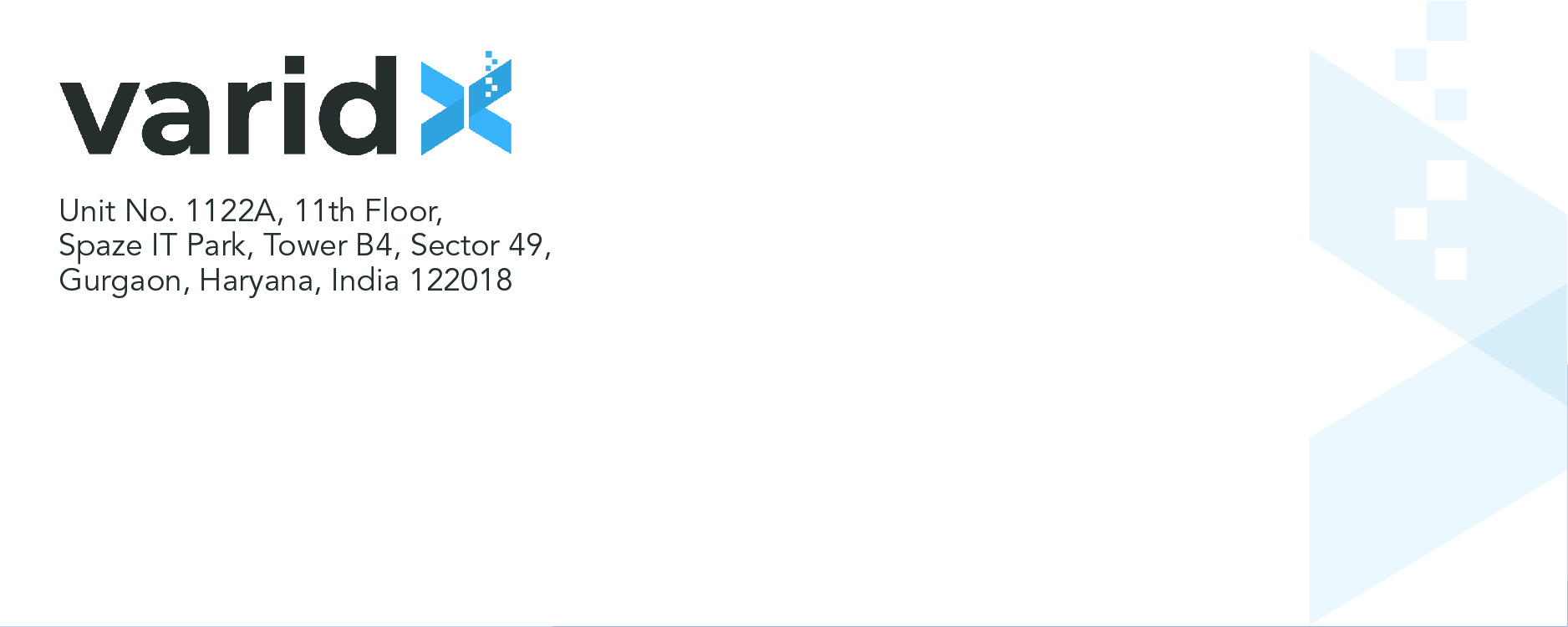
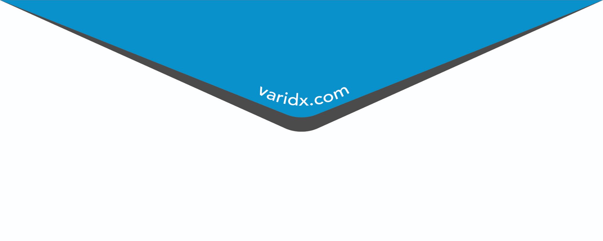
The DL envelope carries the Varidx logo and return address on the front, with the same ghost icon watermark pattern extending to the right edge. The back flap uses the full sky-blue brand colour with varidx.com in white — making the sealed envelope immediately identifiable before it's even opened.
Bold on the back. Clean on the front.
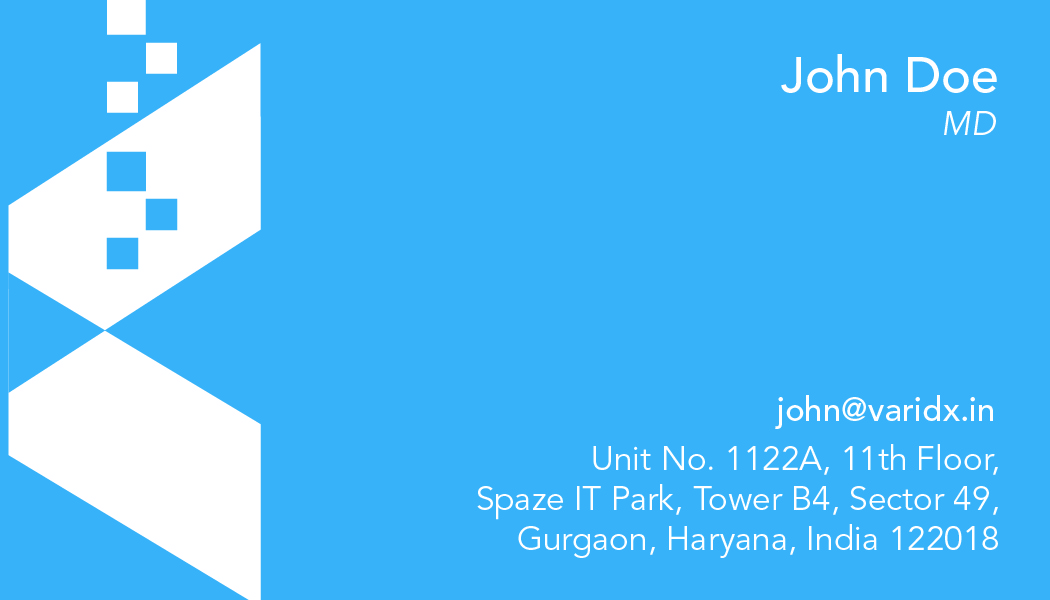
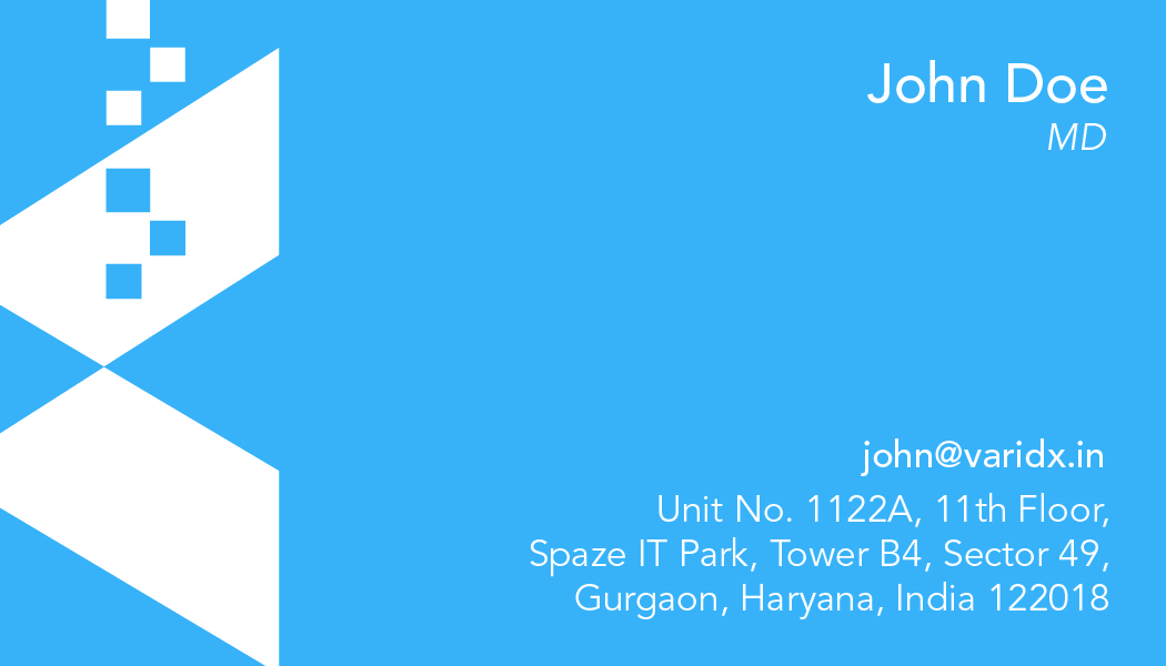
The business card uses a two-sided design with maximum visual contrast. The back is full sky-blue with the X icon mark in white and blue on the left, and the cardholder's name, title, email, and address on the right — striking and immediately memorable. The front is clean white with just the logo and varidx.in URL, providing a calm contrast when flipped.
Logo · Letterhead · Envelope · Business Cards · Identity Mockups
Smart city told through geometric form
- The X icon mark — two converging geometric forms represent data exchange and node connectivity — the fundamental language of smart city infrastructure
- Ascending dot trail — the pixelated dot sequence rising from the icon represents digital signals, data streams, and upward growth
- Sky blue — the colour of technology, trust, and open sky — universally associated with digital intelligence and cloud connectivity
- Charcoal wordmark — grounded, serious, and readable at any size — anchors the mark with corporate authority
- Ghost watermark system — the large-scale icon on stationery creates brand texture without adding visual noise to working documents
From concept to cohesive system
- Brand discovery — stakeholder interviews to understand Varidx's positioning in the smart city technology sector
- Logo exploration — multiple directions explored before arriving at the geometric X icon mark concept
- Colour and typography system established — palette, typeface selection, and usage guidelines documented
- Stationery design — letterhead, envelope, and business card layouts designed as a unified system
- Mockup presentation — 3D renders of the full stationery suite presented to client for approval
- Final file delivery — print-ready files for all pieces exported at full resolution