
Tandoor Indian
Restaurant
A full website redesign and logo design for Tandoor Indian Restaurant in Durham, NC — a 16-year establishment serving authentic Indian, Pakistani, and Bangladeshi cuisine. Modernised for mobile-first with vibrant visuals, clear navigation, and dual online ordering CTAs. Launched 2021.

Launched 2021 with strong client praise — faster access to menu items, better mobile experience, and improved online orders. Only one round of stakeholder feedback needed due to strong initial alignment.
Crafted to carry 16 years of brand heritage forward
The Tandoor wordmark uses a bold, uppercase serif face in the restaurant's signature burnt orange — communicating warmth, authenticity, and premium quality. The lighter-weight "Indian Restaurant" sub-line sits beneath with generous tracking, adding clarity without competing with the main mark. A subtle underline stroke reinforces the visual anchor. The palette was chosen to evoke the glow of a clay tandoor oven — heat, spice, and craftsmanship.
Tandoor Orange
Charcoal Black
Clean White
- ↗ Burnt orange evokes the glow of an authentic tandoor oven
- ↗ Bold uppercase wordmark — confident and recognisable at small sizes
- ↗ Light-weight sub-line creates contrast without visual noise
- ↗ Underline stroke anchors and completes the mark
- ↗ Works on both dark and light backgrounds for full versatility
From greyscale concept to vibrant live website
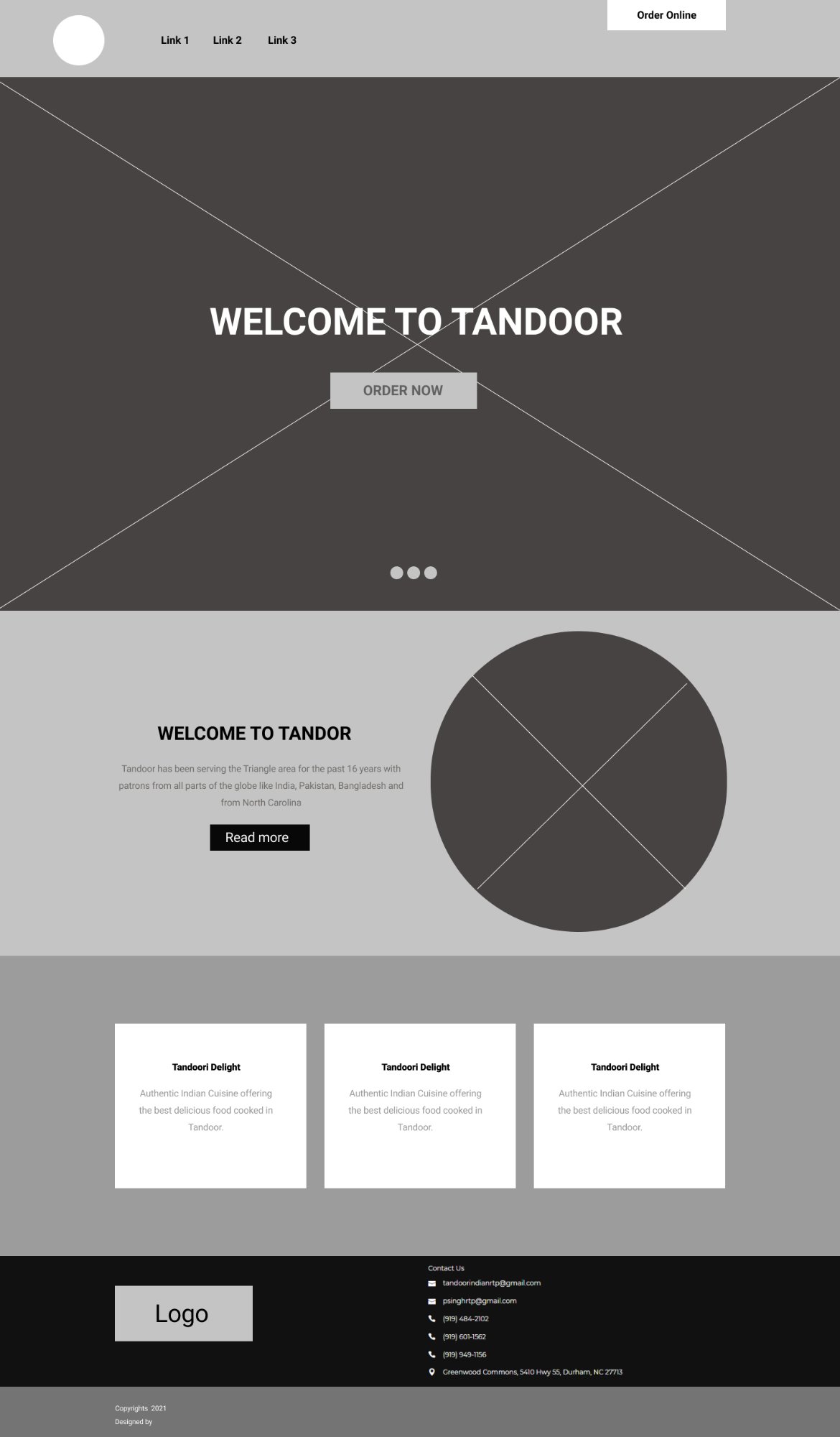
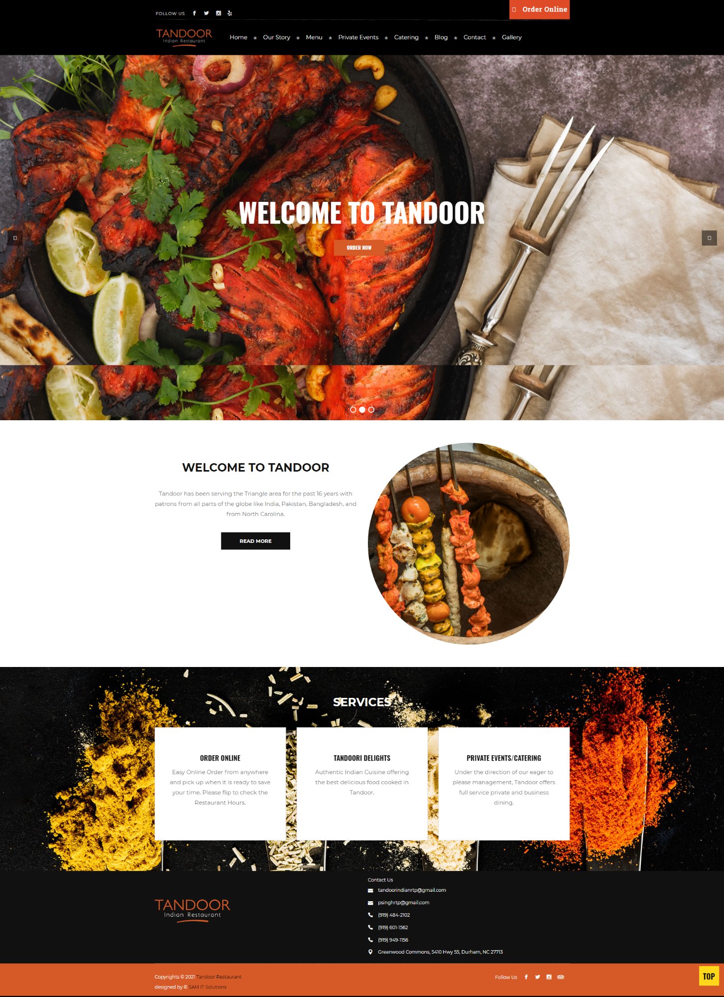
The wireframe established the full page structure — hero slider, welcome section with circular food image, three-column services, and footer with contact details. The final design brings this to life with real food photography, the Tandoor orange palette, and prominent dual "Order Online" CTAs (Zenf Foody + DoorDash) in the header.
Rich food photography across every page
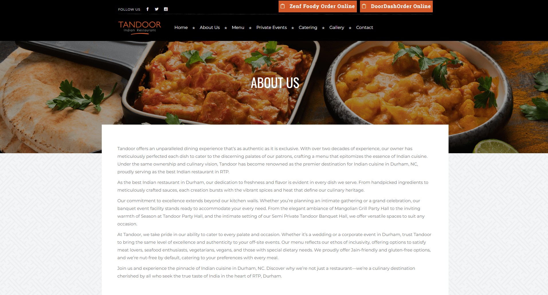
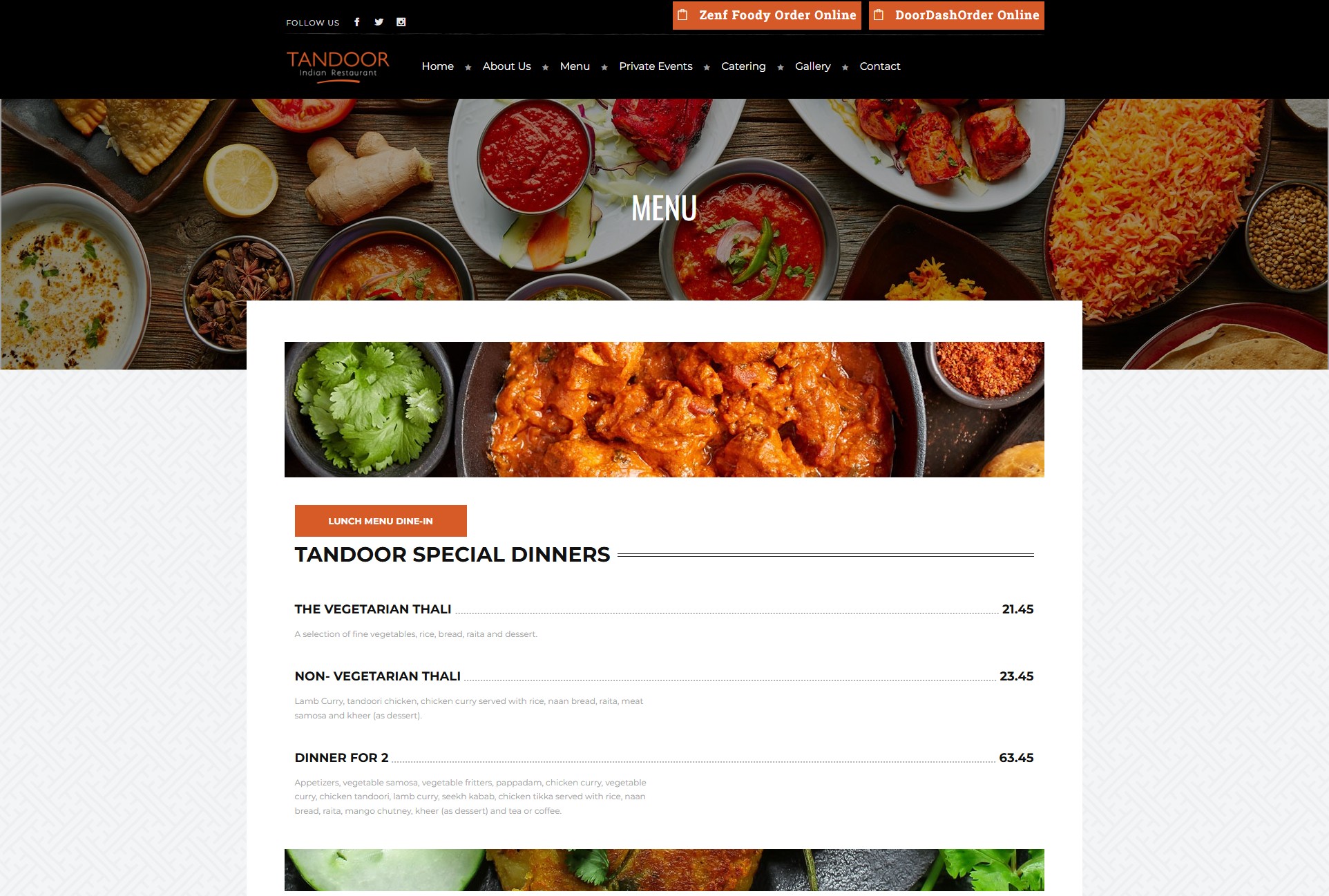
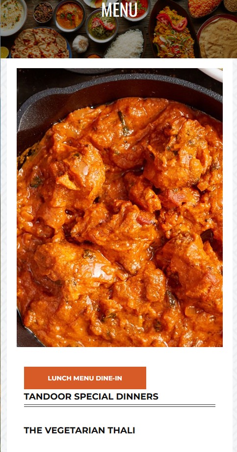
Every page uses a full-width food photography banner as the hero, with the page title centred in white. The About Us page tells Tandoor's 16-year story with body copy on a clean white panel. The Menu page leads with a food image, followed by the "Lunch Menu Dine-In" CTA button, then clearly typeset menu items with prices — Vegetarian Thali, Non-Vegetarian Thali, Dinner for 2, and more.
Mobile-first — dual ordering CTAs always at the top
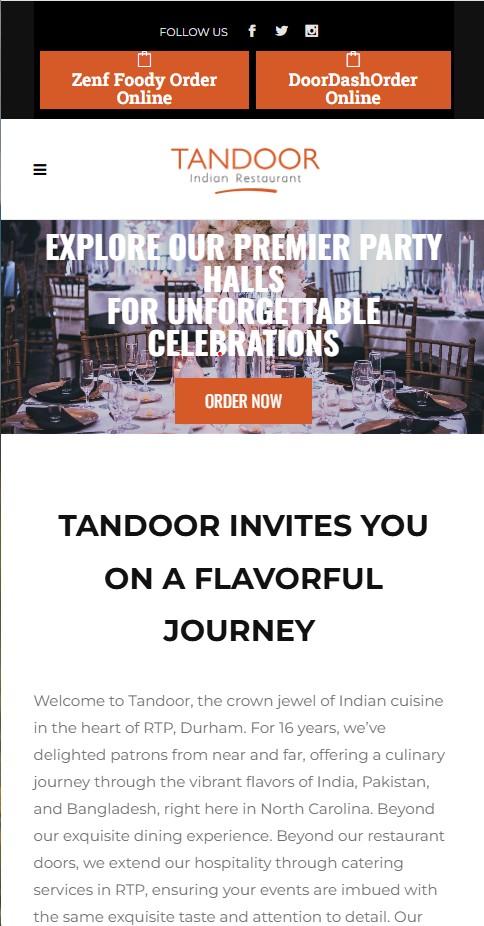
On mobile, the design leads with Zenf Foody and DoorDash ordering buttons in prominent orange strips at the very top — immediately solving the core business goal of driving online orders. The hamburger menu keeps navigation clean while hero sliders, section copy, and images stack cleanly in a single column. The Menu page puts a full-width dish photo first, then the structured menu sections below.
Logo · Wireframe · 4 Desktop/Mobile Pages
Discovery to delivery — fast, aligned, precise
| Phase | Activities | Outputs |
|---|---|---|
| Discovery & Interviews | Stakeholder and customer interviews — restaurant owner, regular patrons; identified pain points around mobile UX and navigation | Prioritised design goals: mobile-first, clean layout, fast access to menu |
| Content Audit | Heuristic evaluation of old site; reviewed content hierarchy and information architecture | Content map, streamlined user journey |
| Sketching & Ideation | Rapid paper sketching of layout concepts for homepage, menu, contact, and gallery pages | Homepage and key screen layout drafts |
| Logo Design | Designed Tandoor wordmark — burnt orange palette, bold serif, underline accent; tested on dark and light backgrounds | Final logo files — PNG, dark and light variants |
| Wireframing | Responsive wireframes in Sketch — focused on intuitive navigation, quick access to menu and ordering, and mobile-first layout | Wireframes for homepage, menu, contact, gallery |
| High-Fidelity Design | Applied colour palette, typography, and food photography to match brand essence; designed mobile + desktop views | Final UI designs — mobile + desktop — all pages |
| Client Presentation | Walked through designs with client; gathered feedback; made minor visual adjustments — only one round needed | Approved final files ready for development |
Four principles that drove the redesign
- Mobile-First Design — collapsible menus, prioritised content sections, and full-width hero imagery optimised for the small screen where most restaurant searches happen
- Dual Online Ordering CTAs — Zenf Foody and DoorDash buttons placed at the very top on mobile, immediately addressing the client's primary business goal
- Quick Access to Menu & Hours — key information (hours, contact, location, menu) visible on the homepage without scrolling
- Modern Visuals — vibrant food photography, Tandoor orange palette, and elegant typography reflecting the lively dining experience at RTP, Durham
Small investments, measurable impact
This project reinforced the impact of thoughtful design for local businesses. With limited time and budget, focusing on mobile usability, clear navigation, and a visual refresh made a measurable difference — customers noted faster access to menu items and improved online ordering, while the restaurant stayed competitive in a digital-first food market.
Listening to both stakeholders and users upfront ensured the design solved real problems — the single feedback round needed is a direct reflection of that strong initial alignment between design intent and client goals.