
Nazara Indian
Bistro
A user-centred website redesign for Nazara Indian Bistro in Cary, NC — growing online sales from 15% to 40% of total revenue through strategic UX, a prominent sticky "Order Online" CTA, and a rich visual redesign that matches the restaurant's vibrant ambiance.
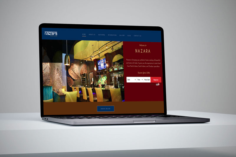
Online sales surged from 15% to 40% of total revenue after the 2019 launch — a 167% increase driven by the always-visible "Order Online" CTA and an improved menu presentation.
Low-fidelity concepts before the final visual direction
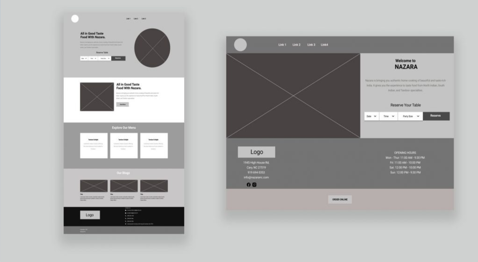
Before any visual design, two wireframe concepts were developed and presented to the client. Option A explored a minimal scrolling layout; Option B introduced a split hero with an inline reservation widget and a sticky "Order Online" CTA — this became the chosen direction.
Homepage hero and About Us page
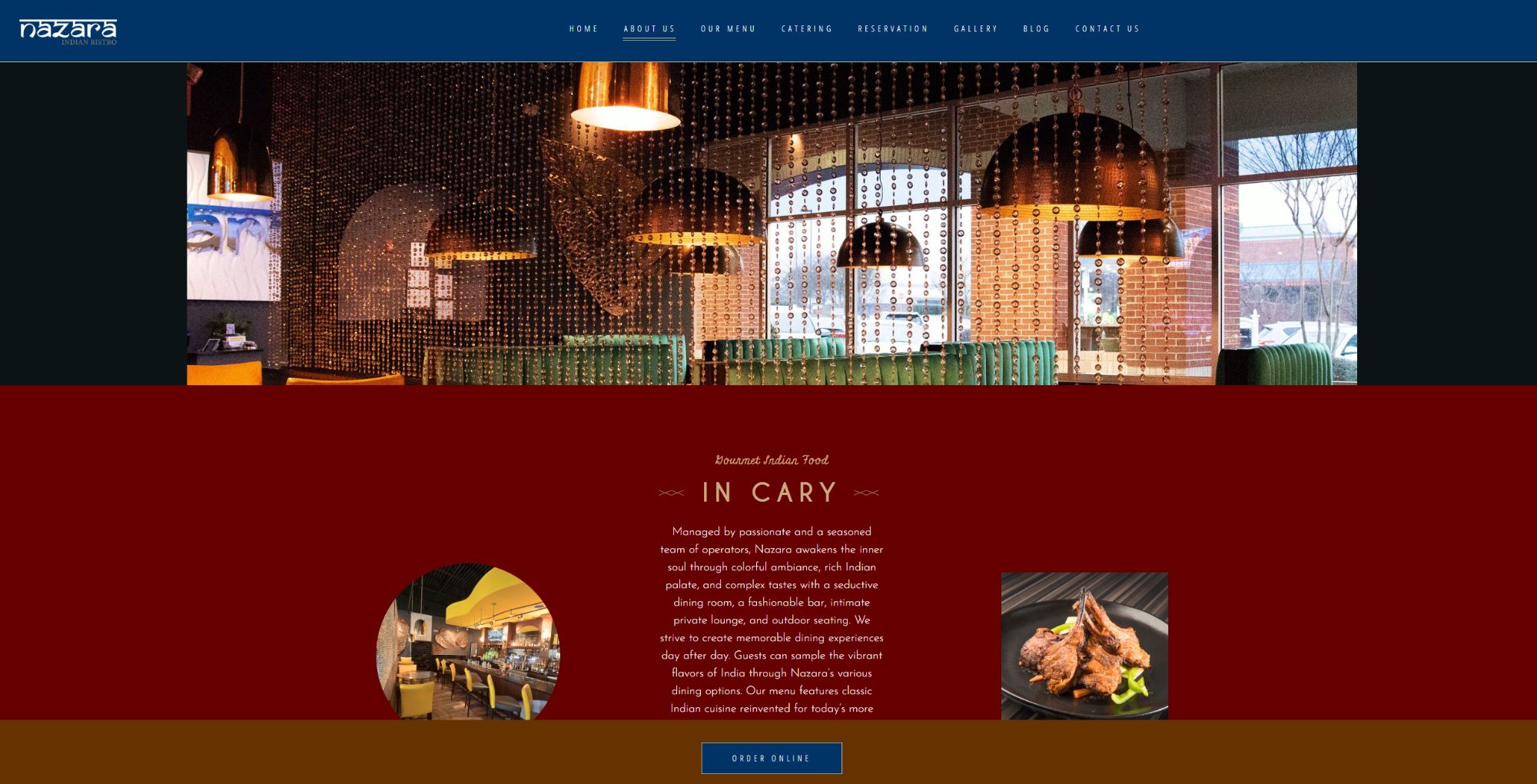
The final design uses deep navy and rich burgundy — reflecting Nazara's premium dining identity. The hero puts the restaurant's actual interior front and centre, with a reservation widget and prominent "Order Online" sticky button.
Fully responsive — food photography leads on mobile
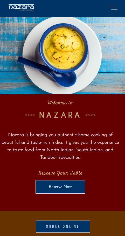
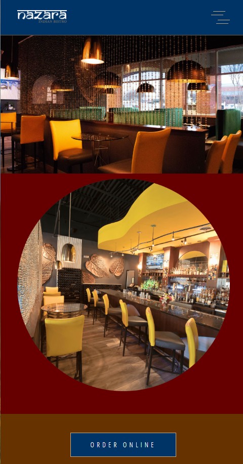
On mobile, the hero food photography fills the screen above the fold, with the welcome message, reservation CTA, and "Order Online" button stacked cleanly below. The interior page uses a dramatic circular image treatment on the deep burgundy background.
Wireframes → Desktop → Mobile
Low online sales despite strong in-person brand
Hidden ordering: The "order online" option was not easily discoverable — only 15% of revenue came from digital channels.
Poor menu UX: The menu structure was confusing — too many clicks to find dishes, no visual hierarchy.
Brand mismatch: The online presence didn't match the vibrancy of the in-person dining experience.
Four strategic UX moves
- Sticky "Order Online" button — always visible, every scroll position on every page
- Inline reservation widget on the homepage hero — Date + Time + Party Size + Reserve in one step
- Rich interior photography as hero — immediately communicates the premium dining experience
- Simplified menu navigation — one click to any dish category, visual food cards with pricing