← All workCASE STUDY
Transit · Accessibility · UX/UI

MTA Access-A-Ride
Customer Profile

Redesigning the paratransit Customer Personal Information Page for NYC's MTA — 100% WCAG 2.1 AA compliance across three visual modes (Standard, Light, Dark), delivered solo in 10 working days.
Client
MTA (AAR)
Timeline
2 Weeks
Services
Re-design · UX/UI · Branding
// STANDARD MODE — Default
MTA Customer Profile — Standard Mode
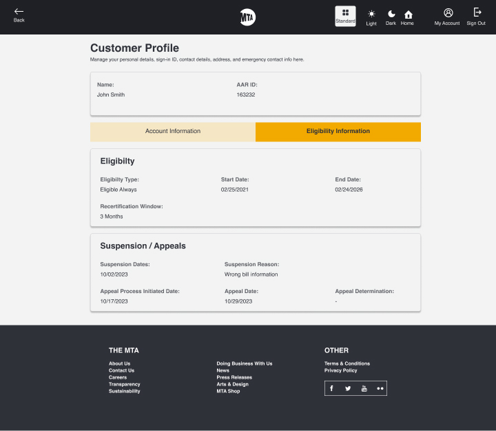
// AFTER REDESIGN · Standard Mode · Eligibility Tab
Project Impact

Achieved 100% WCAG 2.1 AA compliance across all visual modes, enabling MTA to better support users with visual, motor, and cognitive disabilities. Stakeholders praised the improved clarity and navigation.

100%
WCAG 2.1 AA Compliant
3
Visual Modes Delivered
10
Working Days · Solo
4.5:1
Min Contrast Ratio
Before vs After Redesign

From dense legacy to accessible clarity

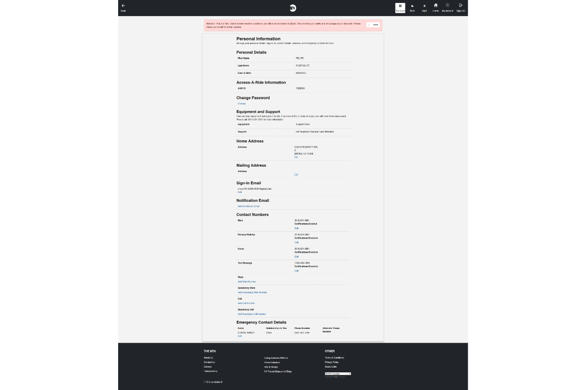
The legacy interface was a single long page with no visual hierarchy, poor contrast, dense data entry fields, and zero customisation options. The redesign introduced clear section grouping, collapsible panels, accessible typography, and a user-controlled theme switcher.
// BEFORE — Legacy Interface
MTA Customer Profile — Before Redesign
// BEFORE — Dense · Low contrast · No hierarchy · Single flat page
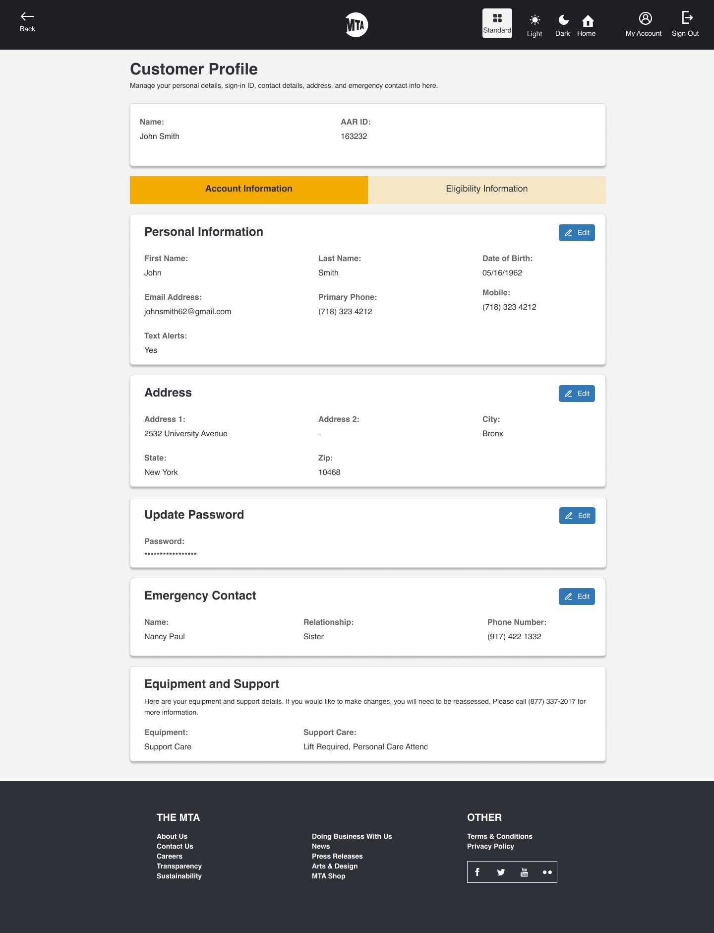
// AFTER — Standard Mode ★
MTA Customer Profile — After Redesign Standard Mode
// AFTER · Standard Mode · Clear hierarchy · Tabbed navigation
Three Visual Modes — All WCAG 2.1 AA Compliant

Standard · Light · Dark — User-Controlled

Each mode was rigorously tested for contrast, keyboard navigation, and readability. Users can switch between modes directly from the navigation bar to suit their visual preferences or accessibility needs.
// STANDARD MODE
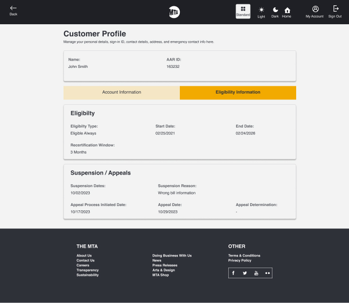
MTA Standard Mode — Eligibility Tab
// STANDARD · Eligibility Tab · Balanced contrast
// LIGHT MODE
MTA Light Mode — Account Information Tab
// LIGHT · Account Information Tab · High brightness
// DARK MODE
MTA Dark Mode — Account Information Tab
// DARK · Account Information Tab · Reduced glare
Account Information Tab — Full Detail

Personal info, address, password, emergency contact

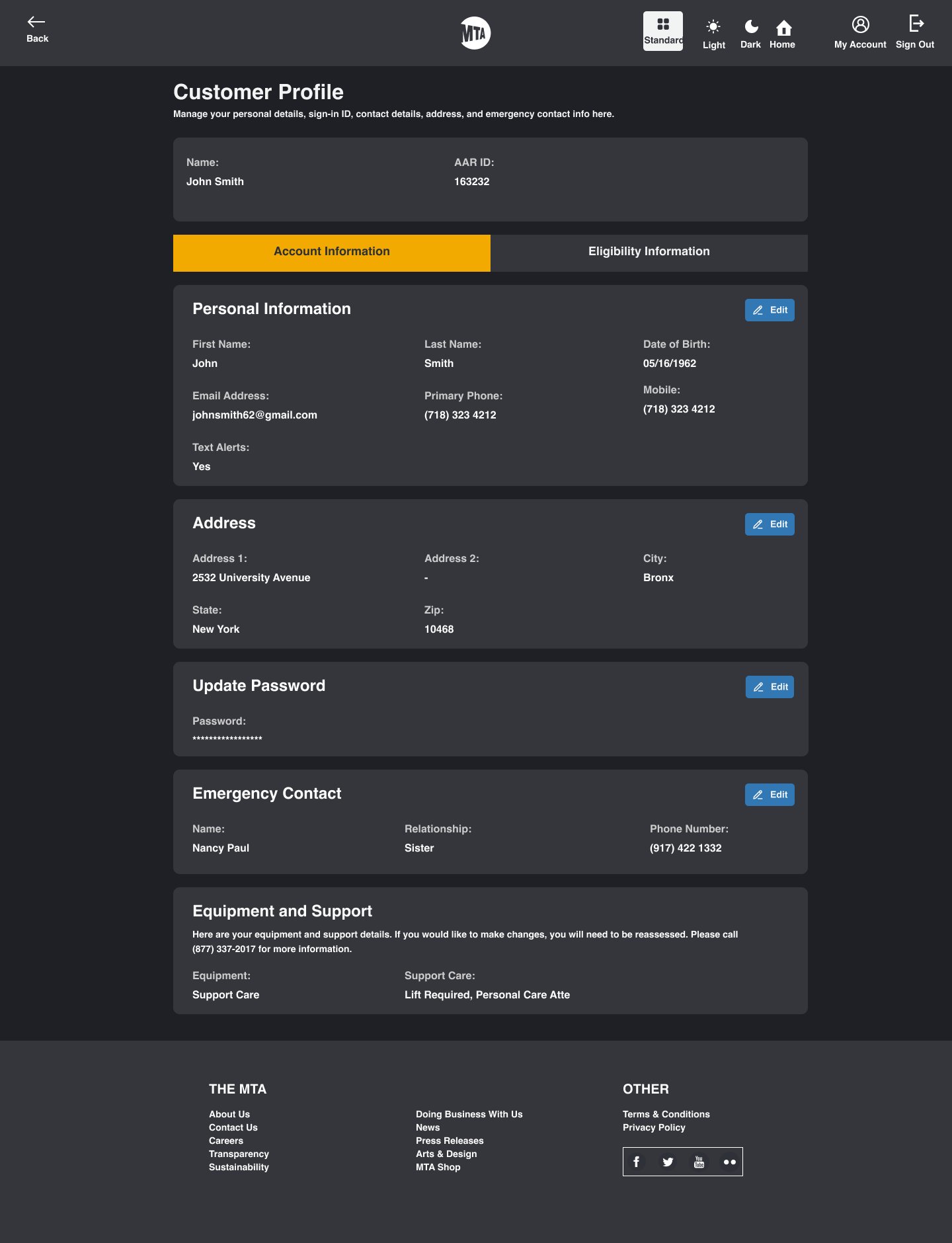
The Account Information tab organises complex data into clearly labelled, collapsible sections — Personal Information, Address, Password, Emergency Contact, and Equipment & Support — each with inline Edit controls for fast updates.

// LIGHT MODE · Account Tab · Full page
MTA Light Mode Full Account Tab
// LIGHT MODE · Personal Info · Address · Emergency Contact · Equipment
// DARK MODE · Account Tab · Full page
MTA Dark Mode Full Account Tab
// DARK MODE · Reduced screen brightness · Neurodivergent-friendly
Mobile Responsive — Every Mode

Fully responsive across all three visual modes

The mobile layout was designed mobile-first — stacked sections with clear labels, touch-friendly tap targets, and all three visual modes fully validated on small screens.
// STANDARD · DESKTOP
MTA Standard Desktop
// STANDARD · Desktop
// DARK · MOBILE
MTA Dark Mode Mobile
// DARK MODE · Mobile · Eligibility Tab
// LIGHT · MOBILE
MTA Light Mode Mobile
// LIGHT MODE · Mobile · Eligibility Tab
// DESKTOP · FULL
MTA Desktop Full View
// DESKTOP · Eligibility Tab · Standard
Side-by-Side Mobile Mode Comparison

Dark vs Light — same content, different visual contexts

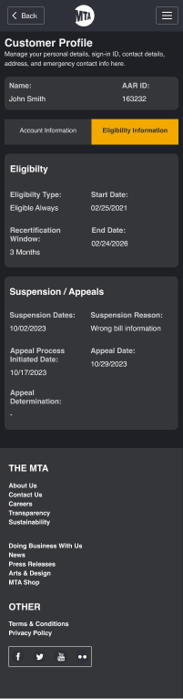
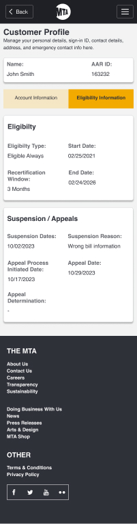
Both mobile modes display the same information architecture and interaction patterns. The visual system adapts colour tokens automatically — no redesign needed when switching modes.

// DARK MODE · Mobile · Eligibility
MTA Dark Mobile — Eligibility and Suspension sections
// DARK MODE · Eligibility · Suspension/Appeals · MTA Footer
// LIGHT MODE · Mobile · Eligibility
MTA Light Mobile — Eligibility and Suspension sections
// LIGHT MODE · Eligibility · Suspension/Appeals · MTA Footer
Process — Accessibility-First Sprint

10 working days · Solo designer · Full delivery

Phase Key Activities Focus
Audit & Research Heuristic evaluation; accessibility gap report; WCAG 2.1 checklist review Define failure points & success criteria
Wireframing Mobile-first low-fidelity wireframes; information architecture; keyboard flow mapping Structural hierarchy & navigation
Hi-Fi Execution Three visual modes in Figma; accessible design tokens; contrast checks per mode All 3 modes WCAG 2.1 AA verified
Testing & Handoff Contrast ratio analysis; keyboard navigation testing; annotated developer specs Validation & developer delivery
Color Contrast
4.5:1
Minimum ratio across all 3 modes
Keyboard Navigation
100%
Full keyboard support with visible focus states
Min Typography
16px
Body text minimum with ample line-height
Complete Screen Gallery

All views — desktop & mobile across all modes

Standard — Eligibility Desktop
Standard · Eligibility · Desktop
Light Mode Desktop
Light · Account Info · Desktop
Dark Mode Desktop
Dark · Account Info · Desktop
Standard — Eligibility Desktop Alt
Standard · Eligibility · Desktop (alt)
Light Mode Mobile
Light · Eligibility · Mobile
Dark Mode Mobile
Dark · Eligibility · Mobile
Legacy interface before redesign
// BEFORE — Legacy interface · Dense · Poor contrast · No sections

KEEP EXPLORING

More selected work ↗

OPEN TO FREELANCE & FULL-TIME OPPORTUNITIES

Let’s make
something useful.

Start a conversation ↗