
MetLife New User
Registration
A data-driven redesign of MetLife's user registration flow — cutting drop-offs by 80% through progressive disclosure, contextual tooltips, and SUS-scored A/B testing across 3 competing designs over 4–5 months.
80% reduction in drop-offs — smoother onboarding, higher completion rates, and a better experience for employees enrolling in benefits.
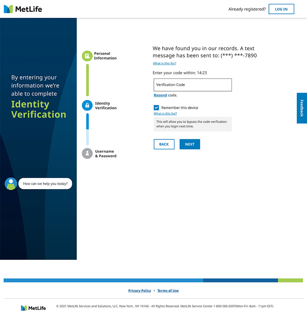
Personal Information → Identity Verification
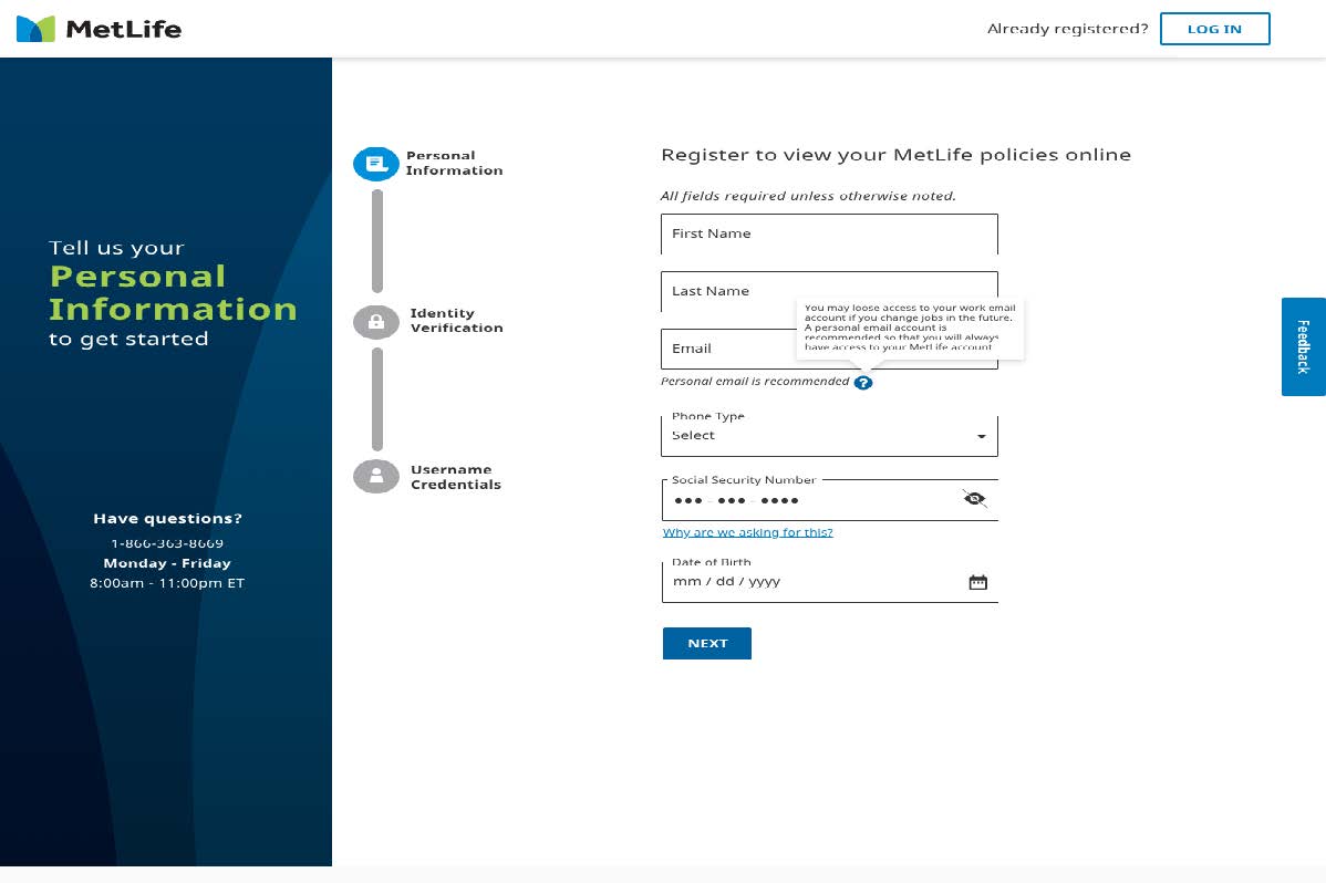
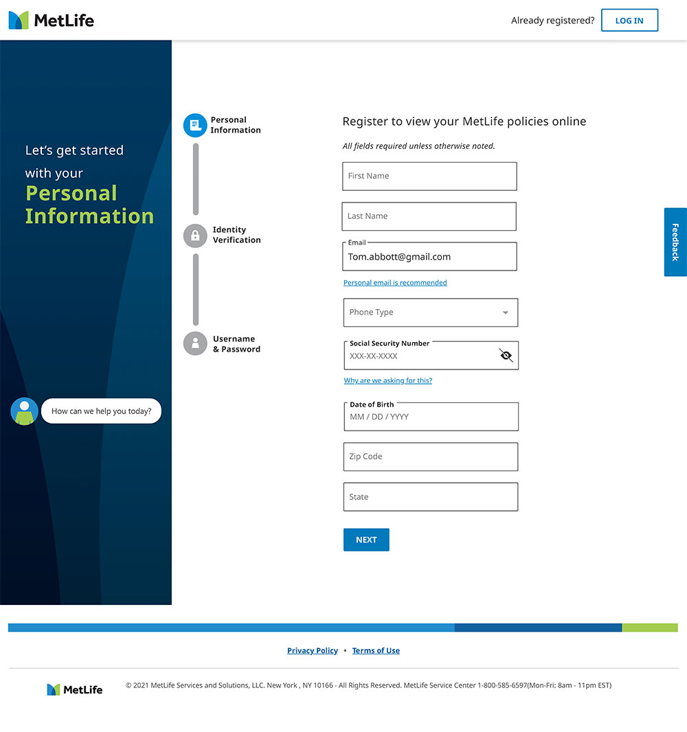
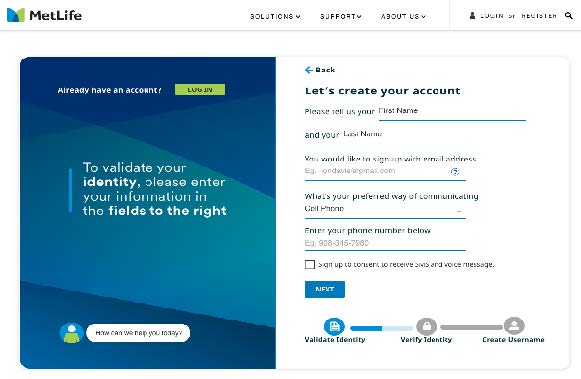
The winning design uses a clear 3-step progress indicator in the left panel, progressive disclosure for each step, and contextual helper text — guiding users confidently from personal information through identity verification to account creation.
Design A · Design B · Design C ★
Three competing registration flows were designed and tested. Each was evaluated on task completion time, user satisfaction rating, and drop-off rate. SUS scoring across all three versions confirmed Design C as the winner on every metric.
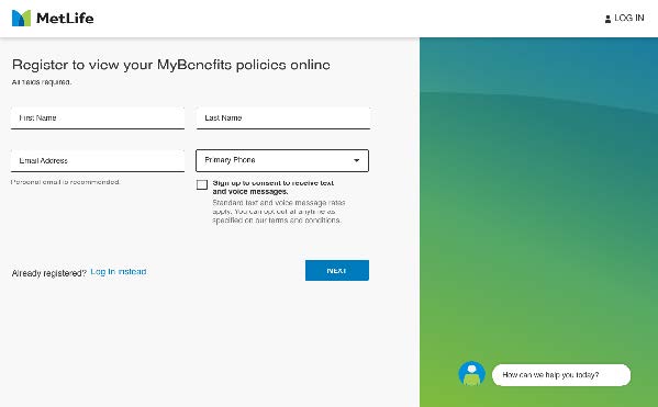
- — Simple two-column form layout
- — No progress indicator
- — Missing contextual guidance
- — Higher cognitive load reported
- — Clear step-by-step structure
- — Bottom progress bar less visible
- — Left panel smaller, less guidance
- — Second best SUS score
- ✓ Left panel with visible progress steps
- ✓ Contextual tooltips (e.g. personal email)
- ✓ Fastest task completion time
- ✓ Highest user satisfaction rating
Design C: what made it work
Design C combined a contextual left panel showing step progress, inline tooltip guidance for sensitive fields (SSN, email), a masked SSN field with eye toggle, and a clear "Why are we asking for this?" link — all reducing anxiety and cognitive friction at each step.
Fully responsive — progress bar adapts to top strip
On mobile the left panel collapses into a horizontal progress stepper at the top — keeping the 3-step journey always visible while giving maximum space to the form fields below.
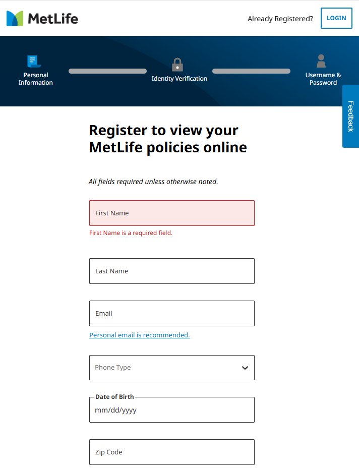
- //Left panel → horizontal progress bar at top of page
- //Full-width input fields — touch-optimised tap targets
- //Inline validation errors appear directly below field
- //Required field error: red border + red helper text
- //"Personal email is recommended" link preserved
Inline validation fires on blur — not on submit — catching errors field-by-field. This reduces the frustration of seeing multiple errors at once and guides users to correct issues as they go.
Error messages are associated with inputs via aria-describedby — screen readers announce the error immediately when the field loses focus.
Seven phases — discovery to post-launch
| Phase | Activities | Outputs |
|---|---|---|
| Discovery & Audit | Reviewed existing overlay & flow, mapped all pain points | UX audit, workflow diagram, heuristics report |
| User Research | Usability tests with new users — identified findability and CTA confusion | Key pain points: findability, unclear CTAs |
| Ideation | Multiple wireframes addressing entry point clarity and flow simplification | Annotated wireframes, 3 prototype variations |
| A/B Testing | Designed & tested 3 flows — 1 by me (C), 2 by team members (A, B) | Analytics on click-throughs and drop-offs |
| SUS Evaluation | System Usability Scale scoring across all 3 versions quantitatively | Comparative SUS scores — Design C wins |
| Design Finalization | Implemented stakeholder feedback on winning prototype (C) | Hi-fi Figma mockups + handoff documentation |
| Post-launch Review | Assessed usage via user feedback and analytics post-launch | Positive reception — 80% drop-off reduction confirmed |
Supporting documentation — open in new tab
The research and design artefacts produced throughout this project are available below. Each document opens in a new tab as a PDF.
// All documents open in a new tab as PDF
All 6 screens — flow, designs, and mobile
From a hidden link to a guided 3-step journey
- ✗Registration buried inside a "Login" link — invisible to new users
- ✗Combined Login/Registration overlay created cognitive friction
- ✗No progress indicator — users didn't know how many steps remained
- ✗Sensitive fields (SSN, DOB) had no contextual explanation
- ✗High drop-off rate before completing even step one
- ✓Distinct "Register Now" CTA in the login overlay — clearly visible
- ✓3-step progress stepper in left panel shows users exactly where they are
- ✓Contextual tooltips for email ("use personal email") and SSN ("why we ask")
- ✓Inline validation on blur — errors caught field-by-field, not on submit
- ✓Aligned to MetLife brand guidelines and accessibility standards