
MetLife Enrollment
Services Portal
A 1+ year platform migration for MetLife's Enrollment Services portal — modernising a dense legacy UI into a clean, MetLife-branded enterprise experience for Benefits Administrators managing dental, vision, life, and disability enrollments.
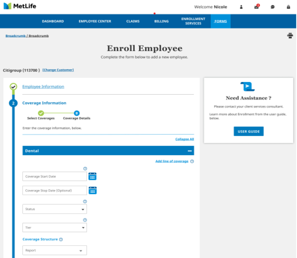
Released Q3 2021 on time and on budget — stakeholders praised the clarity, efficiency, and alignment with MetLife's brand system.
From a dense 2018 system to a clean enterprise UX
The legacy application was built with dense data tables, no visual hierarchy, and minimal UX guidance. Every data field was exposed simultaneously — overwhelming Benefits Administrators who manage hundreds of employee records daily. The redesign introduced progressive disclosure, grouped sections, branded typography, and contextual help.
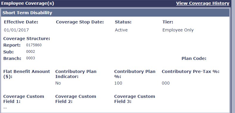
Dense data, no hierarchy, no brand
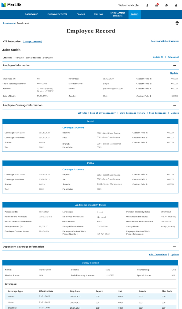
The 2018 legacy system presented all employee coverage data in flat, unstyled tables with no visual grouping, no section prioritisation, and inconsistent labelling. Benefits Administrators had to scroll through multiple data-dense panels to complete basic tasks.
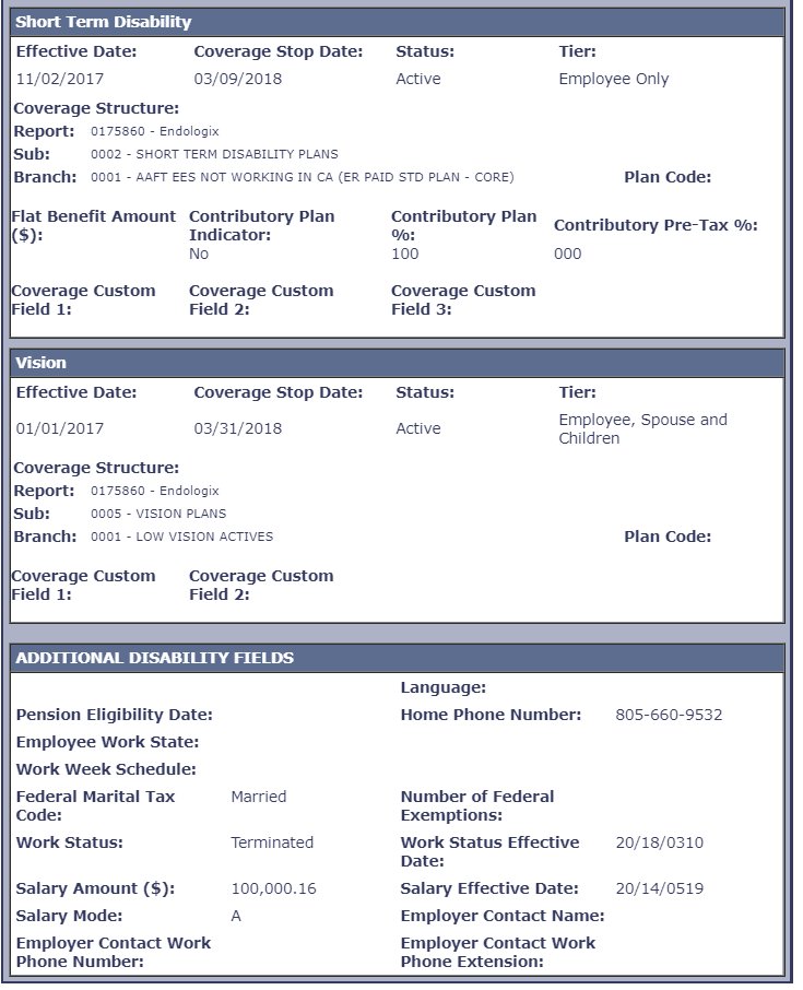
All fields shown simultaneously — equal visual weight regardless of importance.
Dark blue header bars, generic fonts — no connection to MetLife's global brand system.
Complex multi-panel workflows with no progressive disclosure or task guidance.
Fixed-width table layout that broke on any screen smaller than a large desktop.
Enroll Employee · Coverage Details · Employee Record
The new design introduced a 4-step enrollment wizard (Employee Info → Coverage Info → Dependent Info → Review & Submit), collapsible coverage sections per product, contextual help panels, and a clean Employee Record view with all data logically grouped.
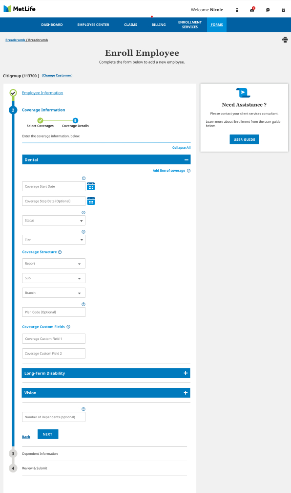
Coverage data: legacy vs redesigned
The same coverage information — employee coverage details, plan codes, dates, status, and tier — presented in two completely different paradigms. The new design uses collapsible accordion panels, clear labelling, and consistent MetLife brand components.
Legacy (2 screens) + New design (3 screens)
Five core UX upgrades delivered
Employee Info → Coverage Info → Dependents → Review & Submit — clear progress at every stage.
Dental, LTD, Vision accordion sections — expand only what you need, reducing cognitive load.
MetLife typography, colour system, and global brand components — consistent with all other MetLife properties.
"Need Assistance?" side panel + info tooltips on fields + User Guide link — reduces support calls.
Accessible colour contrasts, focus states, and labelling across all screens and responsive breakpoints.
Cross-functional Work Pod · Daily standups · Agile
| Phase | Activities | Outputs |
|---|---|---|
| Discovery | Reviewed legacy platform and BRDs; participated in Work Pod kickoffs | Pain point analysis, legacy screens audit |
| Stakeholder Sync | Daily pod calls with BAs, Devs, QA, and Product — clarified requirements and edge cases | Requirement clarifications, design notes |
| Wireframing | User flows and screens in Figma aligned to MetLife enterprise design system | Low and mid-fidelity wireframes |
| UI Refinement | Enterprise design components, accessibility, responsive behaviour applied | High-fidelity Figma mockups |
| Iteration | Weekly stakeholder walkthroughs; adjustments based on feedback | Updated screens and design notes |
| Dev Handoff | Finalized screens, redlines, and interactions delivered to dev team | Specs, documentation, build support |