
DHS NYC
Dashboards
Designed multiple data dashboards for different operational teams at NYC's Department of Homeless Services — giving shelter staff, administrators, and city analysts real-time visibility into census, capacity, violations, intake, and geographic shelter data across all five boroughs.
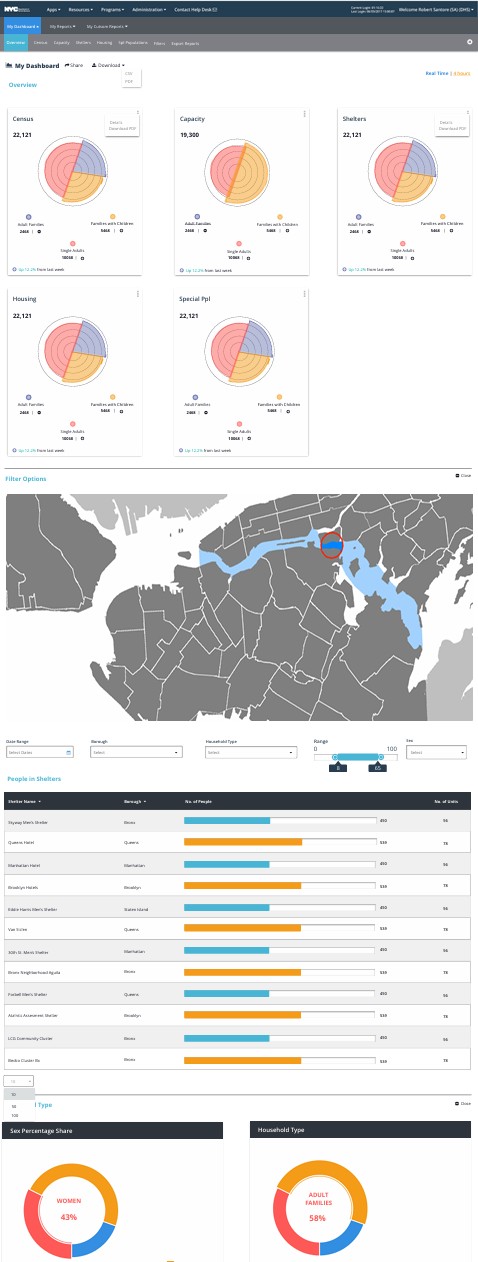
Multiple dashboards designed for different operational teams — from shelter-level overview charts to borough-level geographic filtering and user management tables.
Rapid ideation → functional data interface
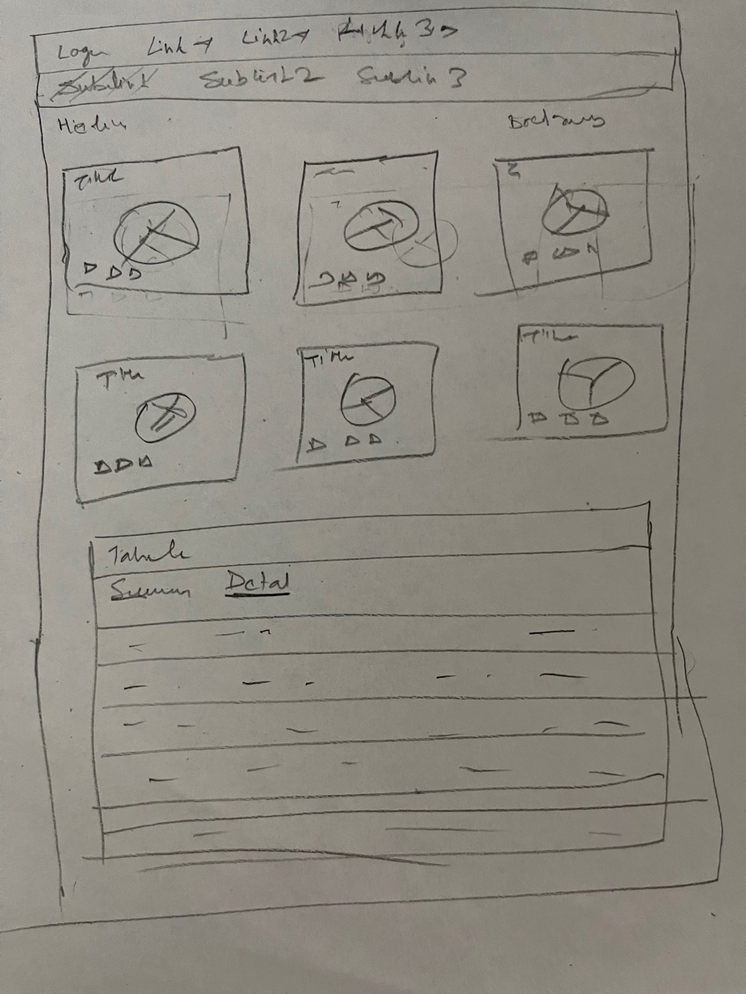
All dashboard concepts started as quick paper sketches — nav structure, KPI card layout, donut chart arrangement, and a data table with Summary/Detail tabs. These were shared with BAs in whiteboard sessions before any digital wireframing began, ensuring alignment on information hierarchy before investing in hi-fi design.
Overview · Map & Shelters · Buildings Detail · Users
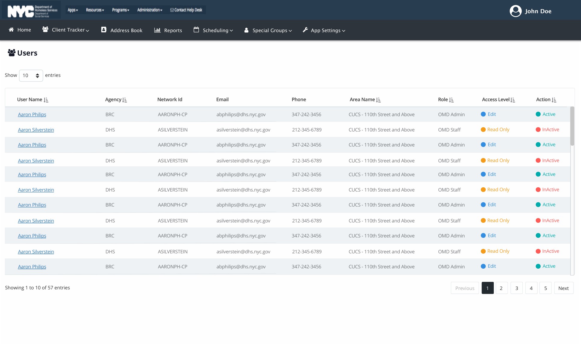
Each dashboard was tailored to a different operational need — the Overview gives DHS administrators a high-level status across all KPIs, the Map view lets analysts filter by borough and household type, the Buildings Detail drills into per-shelter capacity data, and the Users panel manages role-based access across agencies.
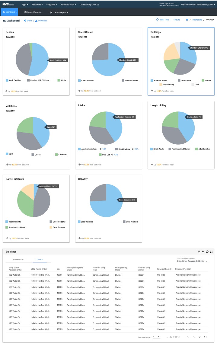
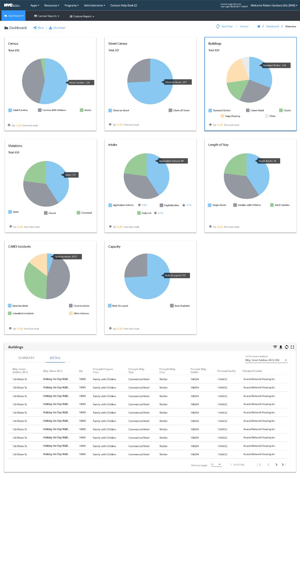
Buildings overview vs complete drilldown
The Buildings dashboard had two views: a compact overview version embedded in the main dashboard (top-right KPI card), and a full-page drilldown with all 8 KPI charts plus a paginated detail data table showing every shelter building with address, zip, program class, facility ID, and provider — 1,542 buildings across all boroughs.
Paper sketch + 4 final dashboards
Designing for data clarity
- Designed multiple dashboards tailored to distinct operational teams — overview, geographic, drilldown, and access management
- Introduced donut chart KPI cards with legend, week-over-week trend indicators, and real-time toggle
- Built geographic map view with filter panel (Date Range · Borough · Household Type · Range) and sortable shelter table
- Designed role-based Users table with colour-coded access level badges (Edit · Read Only) and Active/Inactive status dots
- All designs aligned to Angular Material component library and DHS/NYC government design constraints
Designing without direct user access
- No direct access to end users — all insights came through Business Analysts
- Angular Material component library was mandatory — no custom UI components
- Legacy systems from 2018–2019 required modernisation without full redesign freedom
- BA collaboration as a proxy for user research — weekly review sessions, iterative updates
- BA feedback confirmed improved clarity and usability across all dashboard types