
MTA AAR Taxi/Car Service
Reimbursement
MTA's Access-A-Ride program receives 600+ paper reimbursement requests monthly from paratransit customers who use taxis and car services. I digitised the entire paper process into a responsive, WCAG-compliant online form — matching MTA-AAR's design language and reducing processing time significantly.
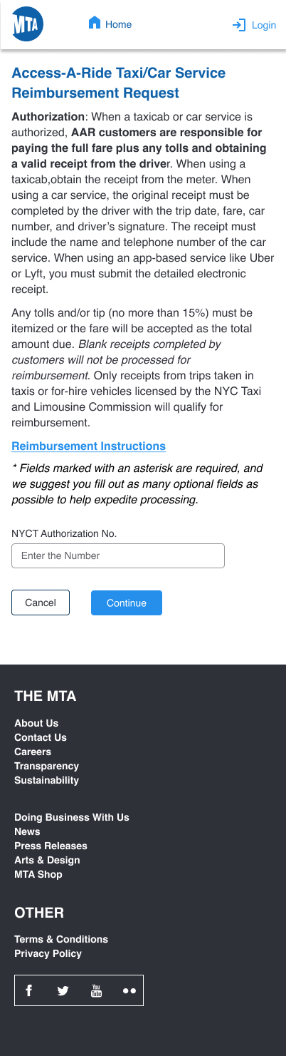
Replaced a 600+ monthly paper form process with a fully digital, accessible online submission — enabling faster reimbursement processing, reduced manual data entry errors, and a better experience for AAR paratransit customers.
600+ paper forms — slow, error-prone, and inaccessible
MTA's Access-A-Ride program authorises paratransit customers to use taxis and car services when AAR vehicles are unavailable. Customers pay the fare upfront and submit a paper form to request reimbursement — up to 600+ forms arriving by mail every month.
This created significant operational overhead: manual data entry, high error rates from illegible handwriting, missing information causing denials, and slow turnaround for customers who needed their money back. Many customers — often elderly or disabled — struggled with the paper process entirely.
Digital-first — faithful to the paper, better than the paper
- Replicated all existing paper form fields exactly — no information loss during the transition
- Added inline validation to catch missing required fields before submission, reducing denials
- Structured form into clear sections: Customer Details, Trip Details, Receipt Upload, and Electronic Signature
- Followed MTA-AAR's existing design language — navy header, MTA logo, blue CTAs, familiar typography
- Built responsive — desktop with side-panel reimbursement policy, mobile as single-column stacked layout
- Full WCAG 2.1 AA compliance — accessible labels, keyboard navigation, and screen reader support
Landing · Instructions Modal · Full Form
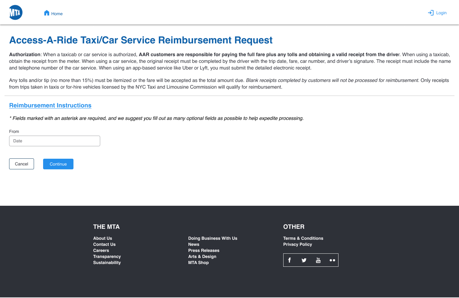
The desktop experience uses a two-column layout — the reimbursement form on the left, the reimbursement policy and rejection criteria on the right as a persistent reference panel. The flow starts with an authorization verification step (NYCT Authorization Number), then opens the modal with 6 numbered instructions before allowing the customer to proceed to the full form.
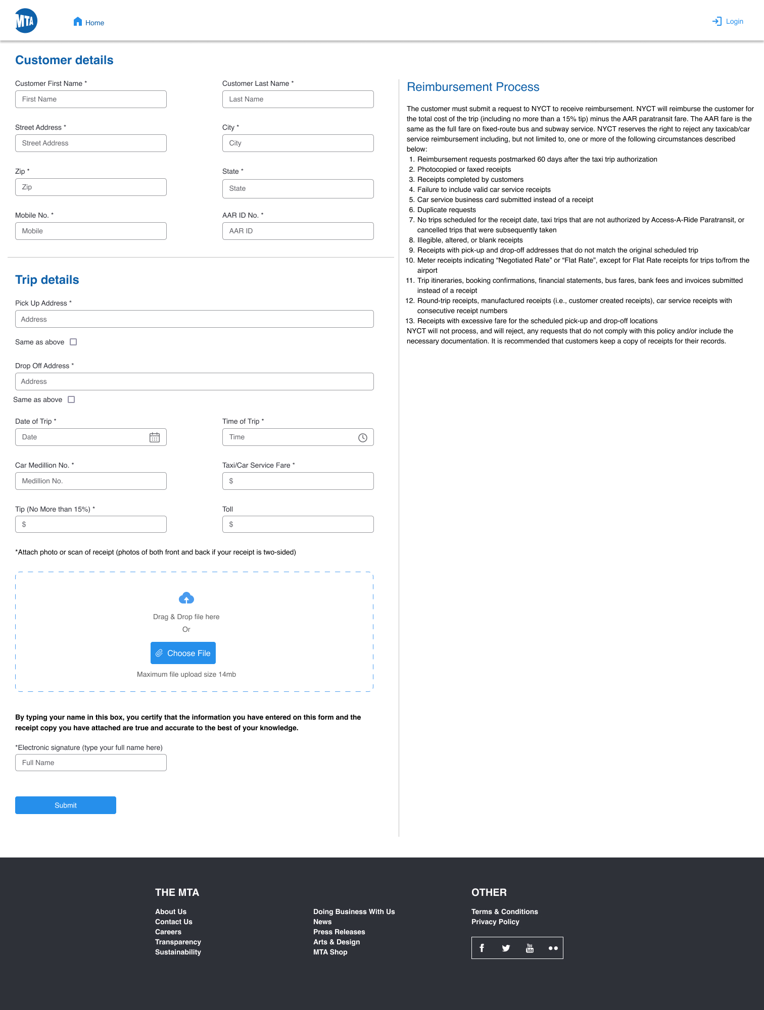
Every paper field preserved — with digital improvements
The form is structured into two clear labelled sections — Customer Details and Trip Details — mirroring the paper form's information groupings. All required fields are marked with an asterisk. The Trip Details section captures everything needed to verify a legitimate reimbursement claim: pickup and dropoff addresses, date and time, car medallion number, fare, tip (capped at 15%), and toll. A drag-and-drop receipt upload replaces the requirement to mail physical receipts.
- → First Name · Last Name *
- → Street Address · City · Zip · State *
- → Mobile No. *
- → AAR ID No. *
- → Pick Up Address · Same as above *
- → Drop Off Address · Same as above *
- → Date of Trip · Time of Trip *
- → Car Medallion No. *
- → Taxi/Car Service Fare *
- → Tip (max 15%) *
- → Toll (optional)
- ✓ Inline validation prevents incomplete submissions
- ✓ Drag-and-drop receipt upload — both sides of receipt
- ✓ Electronic signature replaces physical signature
- ✓ Reimbursement policy visible while completing form
Landing · Instructions Modal · Full Form
On mobile the two-column desktop layout collapses to a clean single-column flow. The instructions modal becomes a full-screen overlay. The reimbursement policy panel from the desktop sidebar moves to below the form. All touch targets meet WCAG minimum size requirements and the form remains fully navigable by keyboard and screen reader.
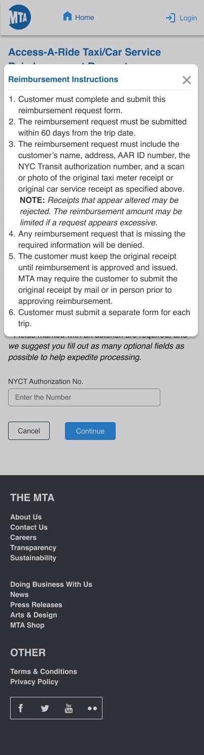

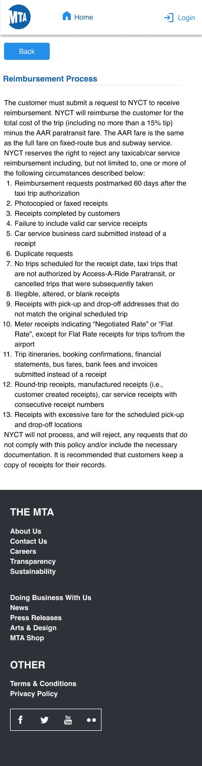
Desktop (3) + Mobile (3) across all states
Faithfulness to the MTA brand + meaningful UX improvements
- Navy MTA header bar with logo matches the existing MTA-AAR portal design exactly
- Blue link colour (#0066CC) and button styling aligned to MTA's UI component standards
- Typography and form field styles match the existing AAR digital touchpoints
- "Reimbursement Instructions" modal replicates the existing paper instruction sheet verbatim
- All 13 rejection criteria from the paper policy are preserved in the digital Reimbursement Process page
- All form fields have explicit
labelelements — screen reader accessible - Required fields marked with asterisk and programmatically indicated via
aria-required - Colour contrast ratios meet 4.5:1 minimum across all text and interactive elements
- Keyboard-navigable form — full tab order, visible focus states throughout
- Date and time pickers include icon affordances for users with motor impairments
- "Same as above" checkbox reduces re-entry burden for users with disabilities
Paper-to-digital — faithful translation with UX polish
| Phase | Activities | Outputs |
|---|---|---|
| Discovery | Audited existing paper form and MTA-AAR digital properties; reviewed reimbursement policy and rejection criteria | Field inventory, flow map, brand audit |
| Information Architecture | Grouped all paper fields into logical digital sections; defined required vs optional fields; mapped user flow from auth check → instructions → form → submit | Field groupings, user flow diagram |
| Wireframing | Desktop two-column layout and mobile single-column responsive layout; modal interaction pattern for instructions | Lo-fi wireframes — desktop + mobile |
| Hi-Fi Design | Applied MTA-AAR brand system, WCAG-compliant colour and typography, drag-and-drop upload component, electronic signature field | Hi-fi Figma screens — desktop + mobile |
| WCAG Audit | Contrast ratio checks, keyboard navigation testing, label association audit, aria attribute review across all screens | WCAG 2.1 AA verified across all screens |