MTA Access A Ride (AAR) Customer Personal Information Page
Branding / UI/UX Design
Project Impact
Achieved 100% WCAG 2.1 AA compliance across all visual modes, enabling MTA to better support users with diverse accessibility needs. Stakeholders praised the improved clarity and navigation, demonstrating that accessibility and efficiency can go hand in hand.
Project Details
Client:
MTA (AAR)
Services:
Re-design, UX/UI Design, Branding
Project Timeline:
2 weeks


Project Description
The MTA Access-A-Ride (AAR) program is a vital lifeline, providing essential paratransit services to New Yorkers with disabilities. This project centered on a high-stakes area: redesigning the Customer Personal Information Page. The goal was simple but critical: transform a legacy interface into one that is intuitive, robustly accessible (WCAG 2.1 compliant), and user-customizable.
The Goal
-
Ensure WCAG 2.1 Compliance: Meet legal and ethical requirements for users with visual, motor, and cognitive impairments.
-
Improve Usability: Simplify complex information hierarchy and data entry to reduce user friction.
-
Offer Customization: Deliver three visual modes (Default, Light, Dark) for user control and comfort.
Challenges: Accessibility at Speed
-
The primary difficulty was the compressed, two-week timeline to deliver a complete, developer-ready, accessible desktop and mobile redesign. I operated as a solo designer, managing all research, prototyping, and validation independently.
-
Tight Deadline: Complete UX research, wireframing, high-fidelity prototyping, and accessibility testing in 10 working days.
-
Triple Mode Delivery: Designing and validating three complete visual systems within a single component system, all maintaining strict WCAG 2.1 AA compliance.
-
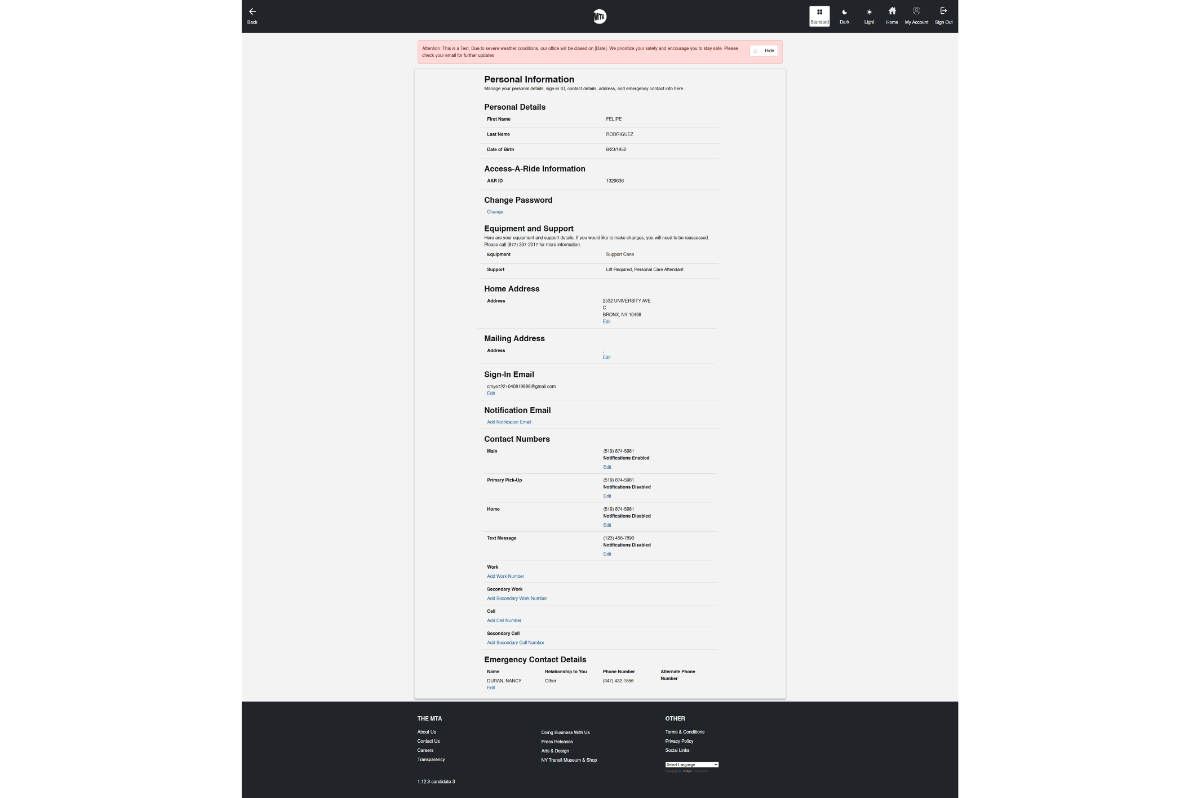
The Problem: Before Redesign
-
The legacy "Customer Information Page" was dense, visually overwhelming, and contained significant accessibility failure points (poor contrast, lack of clear hierarchy, dense fields).
Strategy: The Accessibility-First Sprint
My process was streamlined and iterative, heavily prioritizing accessibility validation at every step. Accessibility was baked in from the foundation by utilizing a component library built on strict color and typography tokens.
| Phase | Key Activities & Deliverables | Focus |
| Audit & Research | Heuristic Evaluation; Accessibility Gap Report; WCAG 2.1 Checklist. | Defining failure points and success criteria. |
| Wireframing | Mobile-first low-fidelity wireframes to define information architecture and keyboard flow. | Ensuring logical flow and structural hierarchy. |
| High-Fidelity Execution | Developing UI in Figma; designing the three visual modes using shared, accessible design tokens. | Contrast checks and responsive design. |
| Testing & Handoff | Final contrast analysis; keyboard navigation testing; delivering annotated specs. | Validation and Developer Handoff. |
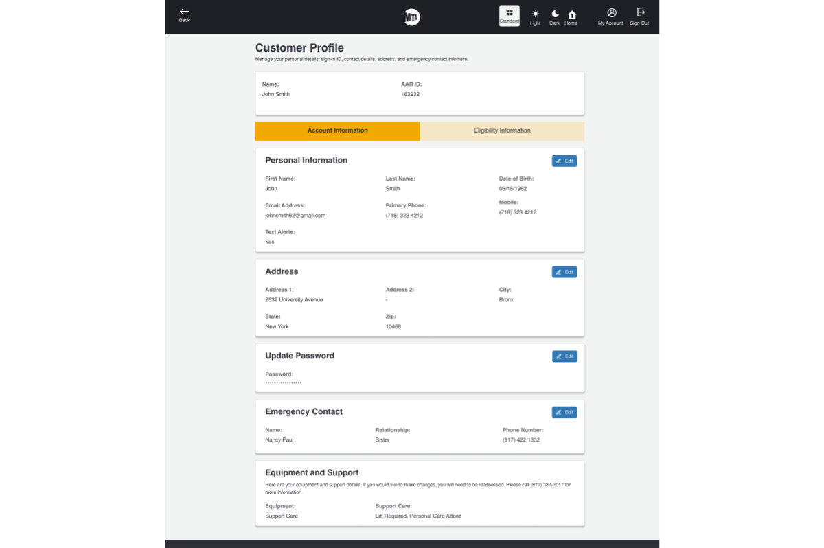
Solution Deep Dive: Clarity and Compliance
The final design focused on clear hierarchy, generous spacing, and robust keyboard navigation. Information was grouped logically into collapsible sections (though not shown below, this was key to reducing cognitive load).
1. After Redesign: Usability and Clarity
The "After" design significantly simplified the visual landscape, reducing user confusion and making fields easier to locate and edit.
2. Three Visual Modes: Accessibility & Customization
The design successfully implemented the crucial requirement of providing three user-controlled visual modes. Each mode was rigorously tested to maintain high contrast and met WCAG 2.1 Level AA standards, ensuring a comfortable experience for all users, including those with photosensitivity or low vision.
| Mode | Visual Aid | Primary Benefit |
| Default Mode | Balanced contrast for general use. | |
| Light Mode | High brightness, maximum contrast for low-vision users. | |
| Dark Mode | Reduced screen brightness and glare for night-time or neurodivergent users. |
Key Accessibility Enhancements:
-
Color Contrast: All elements achieved a minimum 4.5:1 ratio.
-
Keyboard Navigation: Implemented 100% keyboard support with clear, visible focus states.
-
Typography: Used a minimum font size of 16px with ample line height.
Results & Impact
The project was delivered on time (within 2 weeks), fully developer-ready, and successfully exceeded the core mandate of accessibility.
-
100% WCAG 2.1 AA Compliant across all three visual modes.
-
Enabled MTA to confidently support users with visual, motor, and cognitive impairments with an accessible UI.
-
Received positive stakeholder feedback on the clarity of information hierarchy and ease of navigation, proving that speed and accessibility can be achieved simultaneously through a structured, disciplined process.
 Mobile Lighter Version
")
